Looking closely at Pratchett book art shows us a world full of humor, wisdom, and magic. When you hold a Terry Pratchett book, you’re not just holding a story. You’re entering a place where every picture has a special meaning.
The pictures on Terry Pratchett’s books are more than just pretty art. They tell us secrets. This Discworld cover analysis looks closely at these pictures. It finds the hidden messages in the lines and colors of each cover.
Unveiling the Mysteries of Discworld’s Visual Representations
Terry Pratchett’s world of Discworld is known for its clever stories and beautiful covers. These covers are full of symbols that are key to the stories. They’re not just for looks.
Symbols and Motifs in Pratchett’s Fantasy Realm
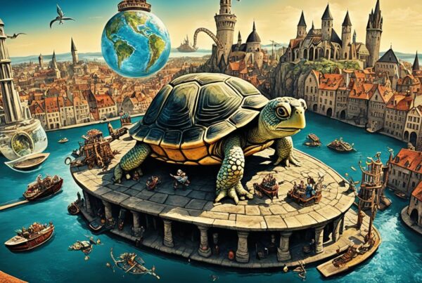
The covers of Discworld books open doors to Pratchett’s magical world. They show readers the amazing places and characters inside. Things like flying turtles and fancy wizards mean more than they seem. They connect to the big ideas of the series.
Decoding Iconography on the Book Shelves
Pratchett’s art is more than pretty pictures. It helps tell the stories. Artists like Josh Kirby and Paul Kidby use their art to share the humor and fantasy of the books. Even before you start reading, the covers tell you about the stories inside.
| Icon | Description | Book Title |
|---|---|---|
| The Luggage | Walking chest with limitless capacity, symbolizing loyalty and danger | The Colour of Magic |
| Great A’Tuin | The giant turtle that carries Discworld, representing the mystery of the universe | General (Multiple Titles) |
| Death | Anthropomorphic representation of death, adding humor to the inevitability of life’s end | Mort |
Exploring Josh Kirby’s Illustrative Genius
Josh Kirby’s artwork is full of fantastical elements and bright colors. His work has left a lasting mark on Terry Pratchett’s Discworld series. Kirby’s cover art changed how people saw the Discworld universe.
How Kirby’s Art Shaped Reader Perception
Josh Kirby’s art made the world of Discworld come alive. His pictures helped readers see the world’s crazy yet logical side. Kirby mixed reality and fantasy in a satirical way.
This made the Discworld series more engaging for readers. It helped them connect with the stories.
Colorful Chaos: A Closer Look at Detailed Artwork
Josh Kirby’s art shows a world full of life and detail. Each part of his artwork has a special meaning, just like Pratchett’s stories. His use of colors and figures grabs and keeps the viewer’s attention.
His art pulls people into a world that is both lively and understandable. Kirby’s cover art is still celebrated in fantasy literature.
The Collaboration Between Author and Artist
Terry Pratchett worked closely with artists on his book covers. He was very involved in the design process. He talked with illustrators to make sure the art matched his stories.
Terry Pratchett’s Role in the Creative Process
Pratchett did more than write stories. He helped create the look of his stories too. He worked with artists to make sure the covers fit his vision. This meant many changes and talks.
From Concept to Cover: The Backstories of Iconic Designs
It’s interesting to see how ideas turn into book covers. Pratchett put a lot of work into this. He wanted the covers to show the deep stories inside.
| Cover Title | Initial Concept | Final Design | Pratchett’s Notes |
|---|---|---|---|
| Night Watch | A chaotic cityscape | Dark, imposing city towers under a clock | Requested an emphasis on the eerie aspect of the city |
| Monstrous Regiment | Subtle military themes | Bold, detailed depiction of a female soldier | Suggested stronger military visuals to highlight themes of war and identity |
| Thud! | Simple game board layout | Complex interplay of chess and warfare elements | Asked for an intricate blend to reflect the plot’s complexity |
The table shows how Pratchett’s ideas changed the art. He made sure the art matched his stories well.

A Journey Through The Colour of Magic’s Art Evolution
The covers of The Colour of Magic have changed a lot over the years. They show how readers’ tastes and fantasy literature have changed. This book was Terry Pratchett’s first, and its covers tell us a lot about fantasy books at different times.
The first covers were bright and fun, showing the magical world Pratchett created. They had bright colors and big fonts that made readers want to dive in. This style was popular back then.
As time went on, so did the covers of The Colour of Magic. They became more modern and simple. This change showed how marketing and fantasy stories were evolving. They moved from being just magical to being more complex and deep.
| Year | Cover Style | Market Trend Influence |
|---|---|---|
| 1983 | Bright and Bold | Initial Fantasy Boom |
| 2000 | Modern and Sleek | Shift Towards Sophistication |
Today’s covers of The Colour of Magic also show how fantasy has changed. They are influenced by movies and books that mix different genres. This keeps the book interesting for readers today.
Every cover of The Colour of Magic shows what was popular at the time. They reflect how people see fantasy books differently over the years. Looking at these covers gives us a special view of how books and readers have changed.
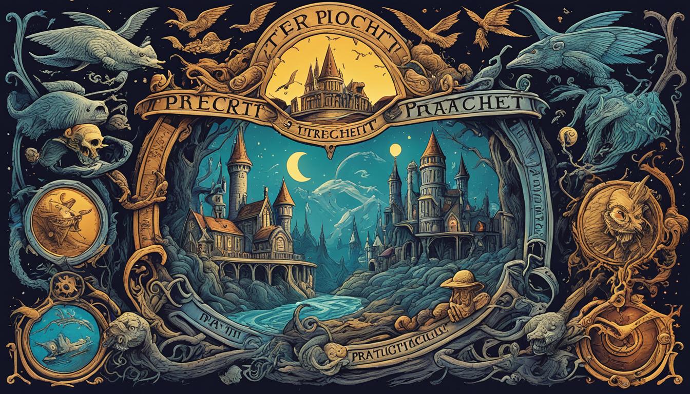
The Hidden Meanings Behind Terry Pratchett’s Book Covers
Terry Pratchett’s books are magical, not just in the stories but also in their covers. Each cover is full of secrets that match the story’s deeper themes. These covers are more than just pretty pictures. They have hidden messages and symbols that make reading more fun.
Pratchett and his artists worked hard to add special themes to the covers. Sometimes, you might miss small details that add to the story. These secrets make readers go back to the cover to find more meaning. It’s like finding hidden treasures in the book.
When fans and experts talk about the covers, they find many secrets. One cover shows characters from the story doing things that hint at big plot twists. This way, the cover art makes reading more exciting and shows off Pratchett’s clever writing.
To really get what the covers mean, you need to understand Pratchett’s style and themes. Each cover is like a key to a world full of stories. It pulls readers into Pratchett’s world before they start reading, making them eager for what’s inside.
Picturing the Satire: How Cover Art Complements Pratchett’s Humor
The covers of Terry Pratchett’s Discworld series grab your attention. They cleverly show the satire in the art. Each cover is like a sneak peek into the humor inside. The art uses visual puns and funny hints to make reading fun even before you start.
The Visual Puns That Fans Love
Visual puns are a big part of Pratchett’s cover art. They make fans smile with their smart use of images. For instance, a turtle in space can mean many things. It shows the Discworld and plays with the idea of a ‘world-turtle,’ making fans chuckle.
Sly Nods and Witty References Embedded in Imagery
The cover art is full of hidden jokes and clever references. These images hint at big events, classic books, and popular culture. They add more humor that only those in the know will catch. Each cover is like a puzzle, encouraging readers to look deeper and find the satire.

Pratchett’s book covers are more than just pretty pictures. They open the door to the satirical world of Discworld. This mix of words and pictures shows how cover art can be a key part of the story.
Cultural References and Easter Eggs in Cover Illustrations
The covers of Terry Pratchett’s Discworld series are more than just pretty pictures. They are full of cultural references and hidden easter eggs. These make reading the series an adventure. They connect the books to our world in a special way.
Spotting the Real-world Parallels
Discworld’s covers have secret nods to current and past events. They make us think about the story and our own world. These references add a smart layer to the book, making us think more deeply.
Unnoticed Details That Enhance the Reading Experience
At first glance, some details on the covers might seem small. But they become clear when we look closer. These easter eggs make us more engaged with the story. They add a special layer to the book that matches the story.
| Book Title | Cultural Reference | Easter Egg Detail | Impact on Reader Experience |
|---|---|---|---|
| “Mort” | Medieval European Death Personification | Hidden hourglass in the background | Emphasizes the theme of time and fate |
| “Guards! Guards!” | Classic Noir Detective | Dragon footprint in the corner of the cover | Subtle hint at a central mystery element |
| “Small Gods” | Theological Critique | Faintly drawn halo around the turtle | Highlights the satire on religious institutions |
The covers of Discworld are more than just pictures. They are part of the story, adding depth and fun. They make us want to read the books again and again, finding new things each time.
The Significance of Typography in Conveying Mood and Genre
Typography in book covers is very important. It sets the mood and helps tell the story. In Terry Pratchett’s books, the right fonts make the cover look great and help tell the story. This shows how important typography is in setting the mood and genre.
Designers pick fonts that match the story’s feel. They choose fonts that show the mix of satire, fantasy, and deep thoughts in Pratchett’s work. Their choices make the book look inviting.
| Edition | Typography Style | Mood Conveyed | Genre Highlighted |
|---|---|---|---|
| First Edition | Gothic Script | Mysterious | Fantasy |
| Revised Edition | Modern Sans Serif | Upbeat and Contemporary | Fantasy & Comedy |
| Collector’s Edition | Elegant Serif | Classic and Timeless | Fantasy & Adventure |
Typography makes genres stand out and sets the mood before you start reading. It acts like a silent guide. It tells you what to expect from the book and makes reading more fun.
Revamping Classics: The Art of Updating Pratchett’s Book Covers
Updating classic book covers is a tricky task. It’s about keeping the old charm and adding new trends. This is clear in the new covers for Terry Pratchett’s books. These updates show how tastes and strategies have changed over time.
Maintaining the Magic While Modernizing
It’s hard to update classic book covers without losing their original magic. The goal is to make them look good to new readers. This means keeping the key images or fonts that made the books special, but making them better.
Comparing Old and New: The Evolution of Cover Styles
Looking at old and new book covers shows how design ideas have changed. Early covers of Pratchett’s books had lots of pictures, showing the fantasy world. Now, covers are simpler, with big fonts and symbols that hint at the story’s deep themes.
New book designs make classics look fresh and attract new readers. By comparing old and new covers, we see how book art changes over time. This shows how covers can tell their own stories of change.
Paying Tribute: Posthumous Releases and Memorial Editions
After Terry Pratchett passed away, many special editions came out. They are tributes to the author who made millions laugh and think. These editions let new and old fans enjoy his works. They keep Pratchett’s magical worlds alive for everyone.
Special Editions that Honor Terry Pratchett’s Legacy
These special books come in fancy covers and leather bindings. They show how much people value Pratchett’s stories. Each edition is a tribute to his genius, letting readers feel close to his stories.
Keeping the Spirit Alive Through Visual Art
Artists agree: Pratchett’s work should be kept alive and bright. So, they make special book covers that show his style of humor and fantasy. These covers help us feel connected to Pratchett, keeping his stories alive for others to love.